Impressive branding designs by LCDF - Hanoi Graphic design students
- lcdf
- Ngày 03 tháng 6 năm 2021
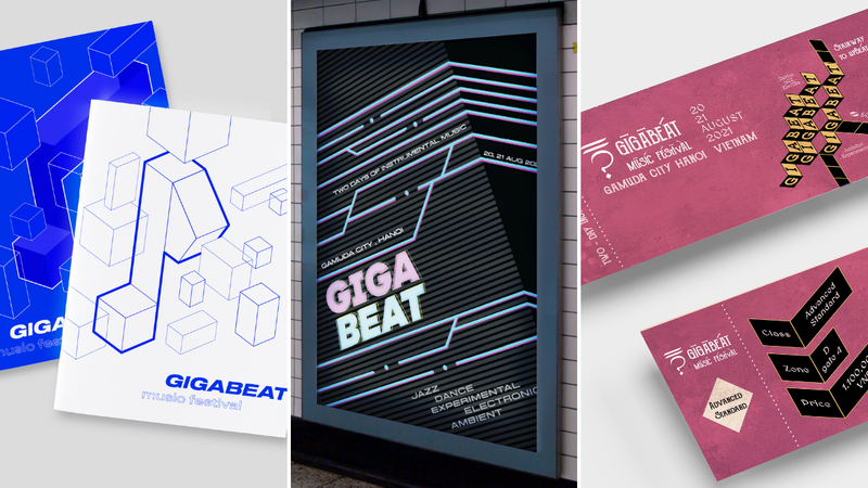
Graphic design students at the London College for Design & Fashion – Hanoi (LCDF – Hanoi) were assigned a brading project in the last academic term. They have come up with their most creative solutions to make the music festival the most attractive to the audience.
Let's take a look at some of these works.
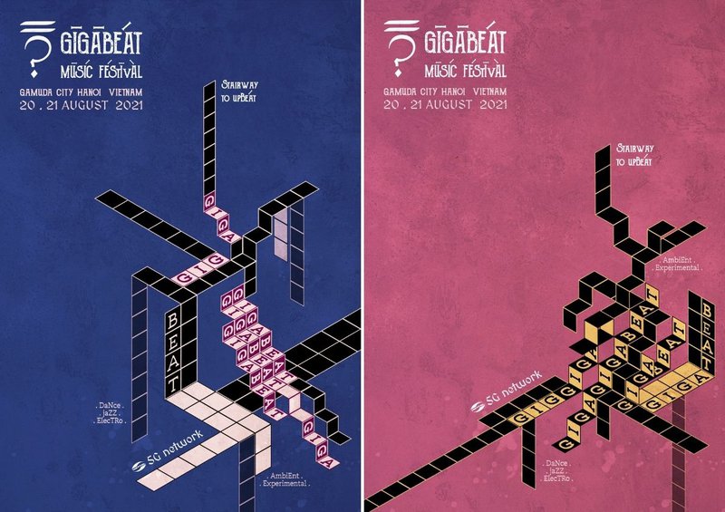
"Stairway to Upbeat" was inspired by map folding technique and the famous Led Zeppelin's song "Stairway to Heaven". With this concept, Vi Huyen Linh wants to show the different "stairways of feeling" that the audience will go through and enjoy while attending the music festival.
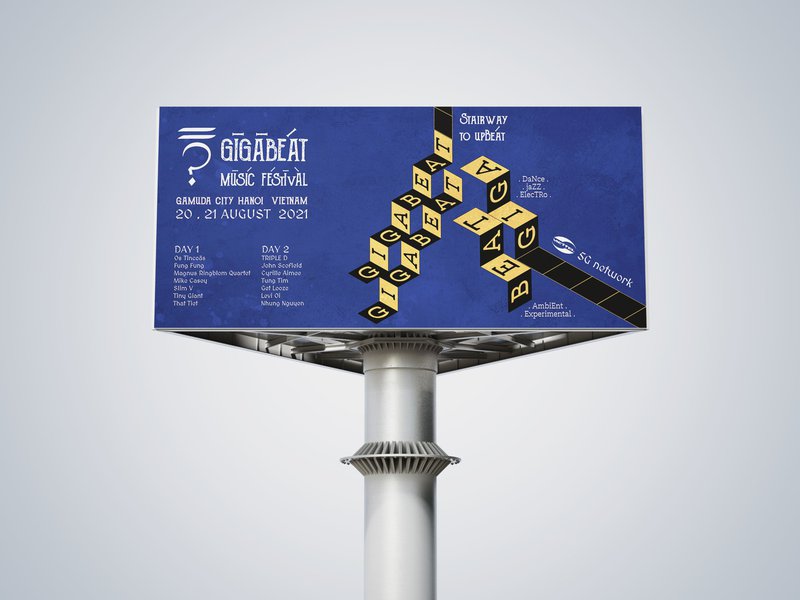
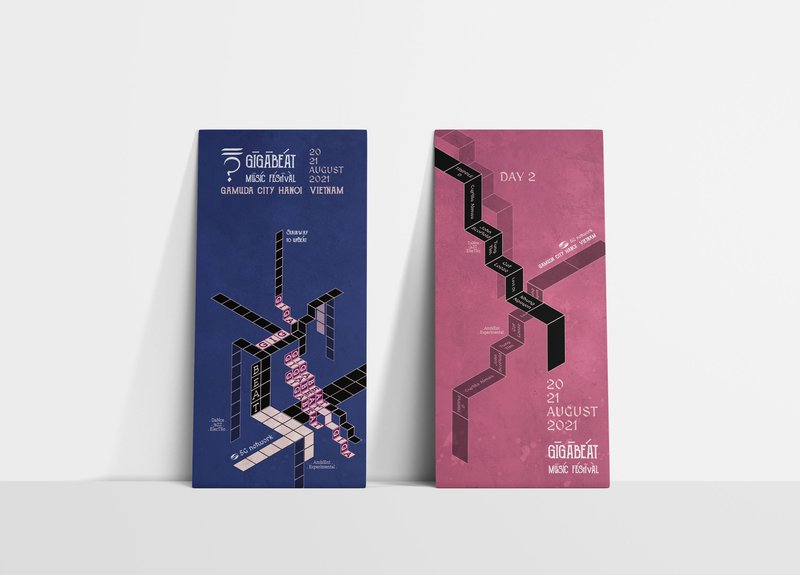
Different emotional stairways going in up and down, left and right to emphasize that the music festival GIGABEAT will bring a lot of curiosity, excitement and pleasure to the audience with each music genre.
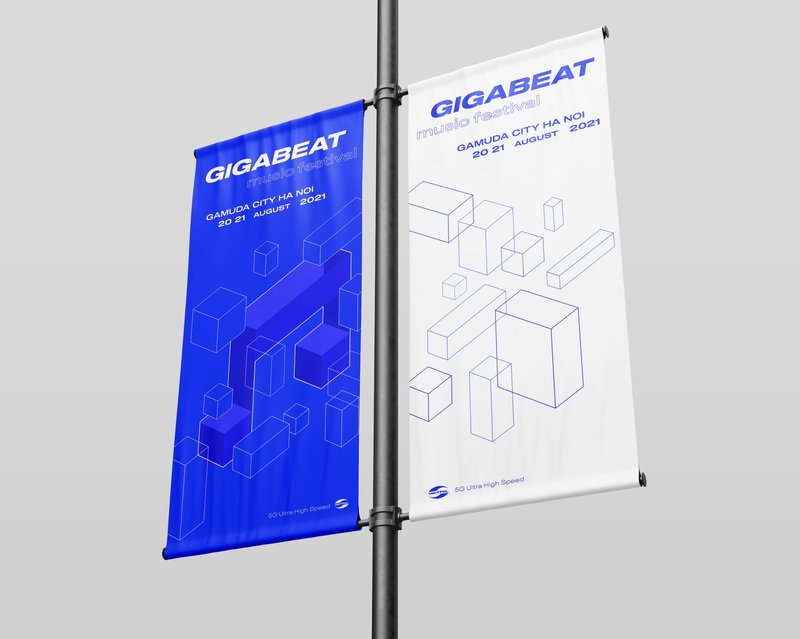
Nguyen Van Anh's works "Floating Puzzle" focuses on the unique characteristics of each music genre featured at the festival. Van Anh has turned them into different "puzzle pieces" to arouse the curiosity of the audience and encourage them to explore and connect the other pieces to give themselves the fullest experience.
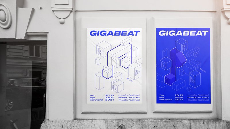
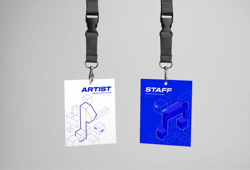
The use of bold lines, contrasting blue and white colors, etc., also helps to create a world of music that is full of freedom and flexible movement like pieces floating in the sky.
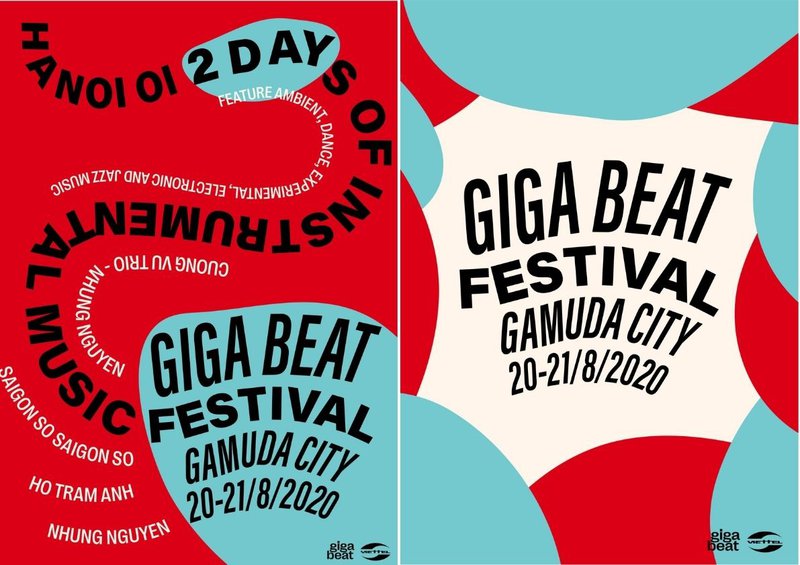
Nguyen Phung Xuan Anh used the image of a stream flowing through pebbles to create a brand identity for GIGABEAT. Xuan Anh compared the stones and flowing water to musical notes lying on a music stave, varying with each melody.
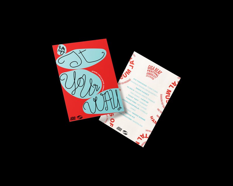
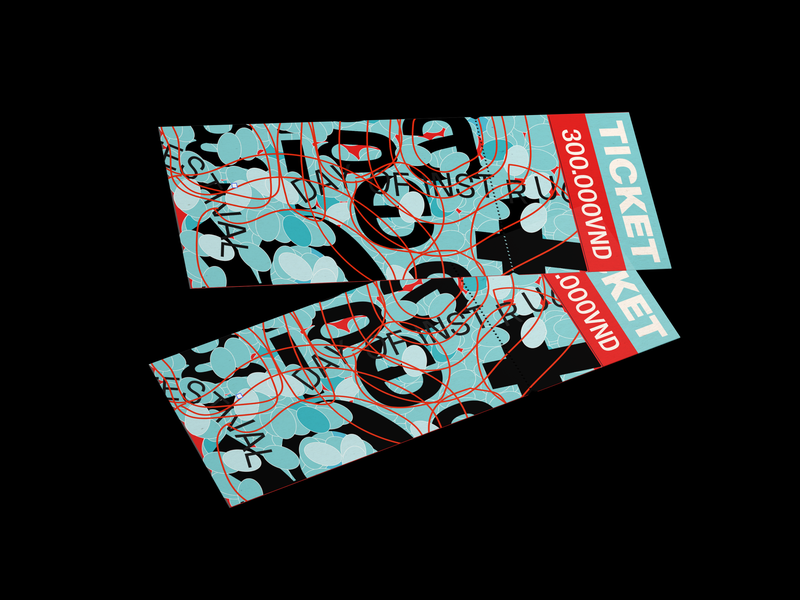
The festival tickets were attractive thanks to the very contrasting cyan blue and red, and water-like contours moving with the rhythm .
Music or art, in general, are both abstract concepts. Each of us will have different thoughts and feelings about music, but surely, there will be times we associate the melodies we hear with different shapes and sizes. Ha Vu Khanh Linh's works exploit this idea to create unique shapes for the music festival.
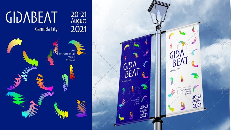
Khanh Linh took the "G" in GIGABEAT to create freeform shapes, symbolizing each person's feelings when attending the festival. The use of gradient colors also shows the relationship between people and art.
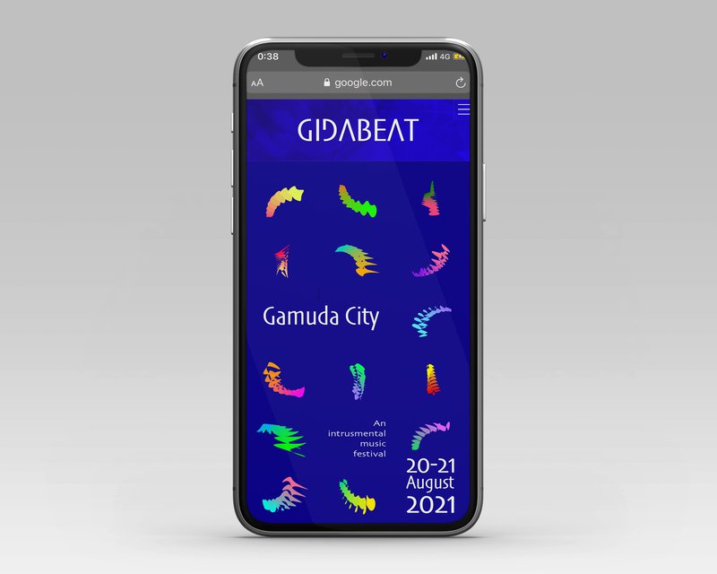
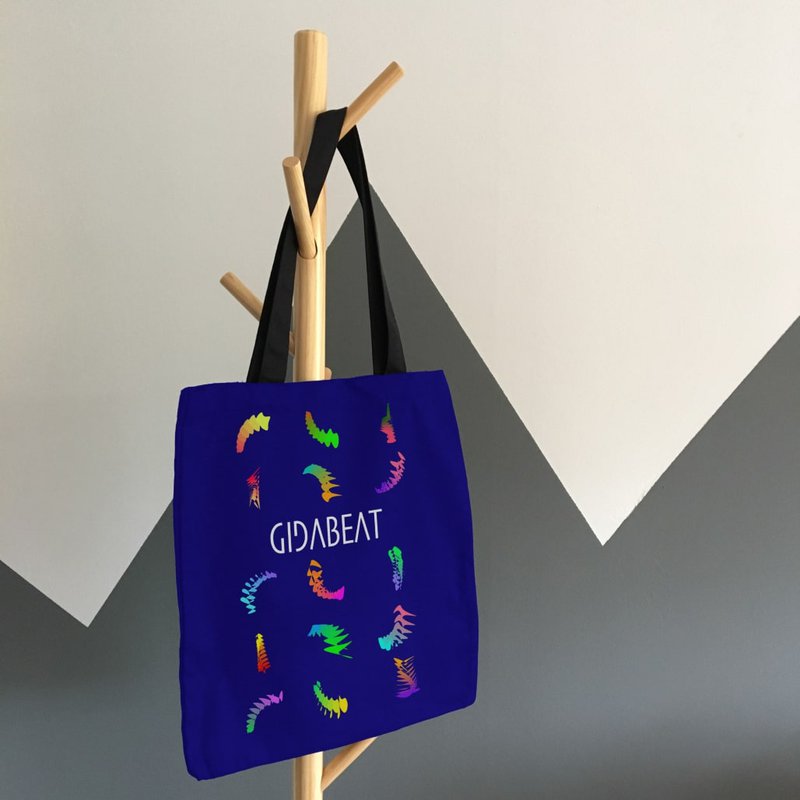
Not only posters or billboards, graphic design also consider other deliverables such as websites, tickets, brochures and other merchandises.
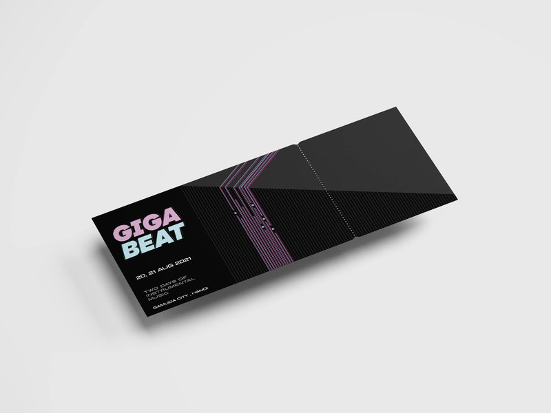
Finally, let's travel to the future with the designs by Hoang Dao Minh Nhat. Realizing that music festivals in Vietnam are developing rapidly alongside modern technology, Minh Nhat brings the sturdy lines of a circuit board and futuristic neon pink and blue palette to his works.
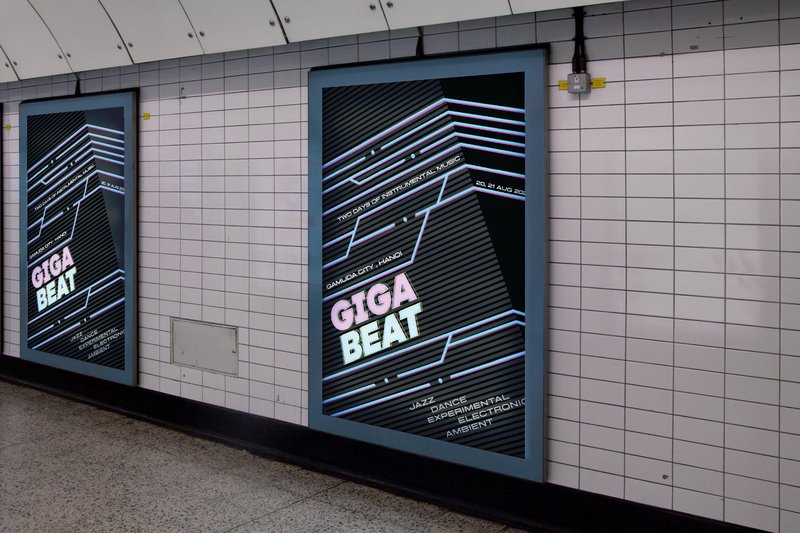
The main inspiration of Minh Nhat is the Light Trace effect, which occurs when light moves at high speed, forming beautiful light trails and shadows.
We cannot list out all the creative design works in this article. With some of the above works we hope that these creative ideas will continue to be endless sources of inspiration for our graphic designers and their future designs.


